Project Summary
Assessment_2_finalProof (Score: 76 / 95)
Coursework in Geophysical Data Science: I downloaded and processed a HadCRUT data set and produced visualisations to find evidence for climate change and extreme events. I also used the data to compare the abnormal temperature conditions of similar environments worldwide.
Key Figure 1: Global Mean Temperature
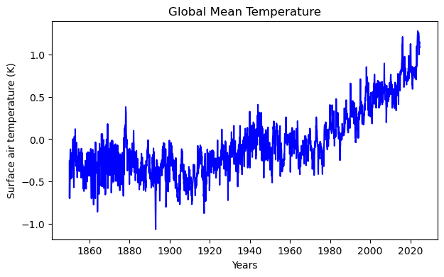
This graph shows the global mean surface air temperature in Kelvin (K) from 1860 to 2020, with fluctuations ranging from -1.0 to +1.0 K and an increase, especially visible from 1980 onwards.
Good aspects: The graph is clear and easy to read, and the data trends are visually distinguishable.
Bad aspects: The axes lack a reference point (e.g., pre-industrial baseline), and a trend line.
Key Fig 2: Null Value Distribution
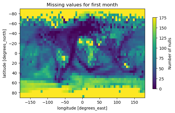
This graph displays missing data (null values) for the first month across different latitudes and longitudes, with the number of nulls represented on a colour scale.
Good aspects: The use of a spatial (latitude-longitude) plot effectively visualises geographic patterns in data gaps, and the colour scale helps distinguish regions with higher missing values.
Bad aspects: The title ("Missing values for first month") is vague, it doesn't specify the dataset or time. The colour scale's numeric labels (e.g., "175") are unclear without units or context, and the axis labels could be more prominent for readability.
Key Fig 3: Global Warming Pattern
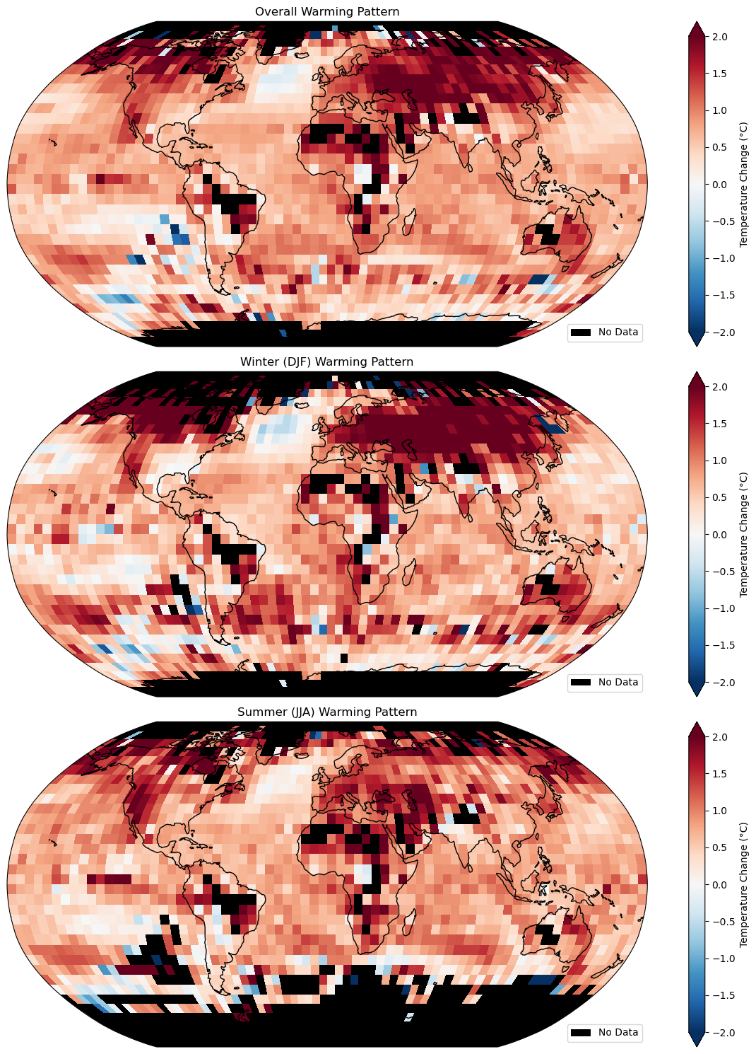
This graph compares seasonal (winter DJF and summer JJA) and overall global warming patterns, showing temperature changes (°C) with a clear upward trend from 1960 to 2020.
Good aspects: The graph clearly shows seasonal and long-term temperature changes with a simple color scale (red for warming, blue for cooling). The side-by-side panels make it easy to compare winter and summer trends
Bad aspects: The y-axis has a typo ("-0.0" instead of "0.0"), and the title is too vague, it should include the time period (1960–2020).